-
Type:
Bug
-
Resolution: Done
-
Priority:
 High
High
-
Affects Version/s: None
-
None
-
STOP TB Sprint 8
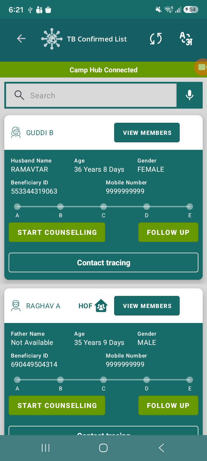
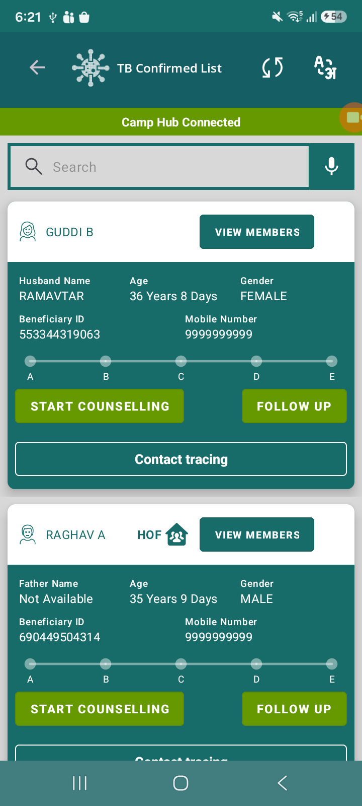
In the TB Confirmed List screen, the actions Start Counselling, Follow Up, TPT Module and Contact Tracing are currently displayed within the same beneficiary card.
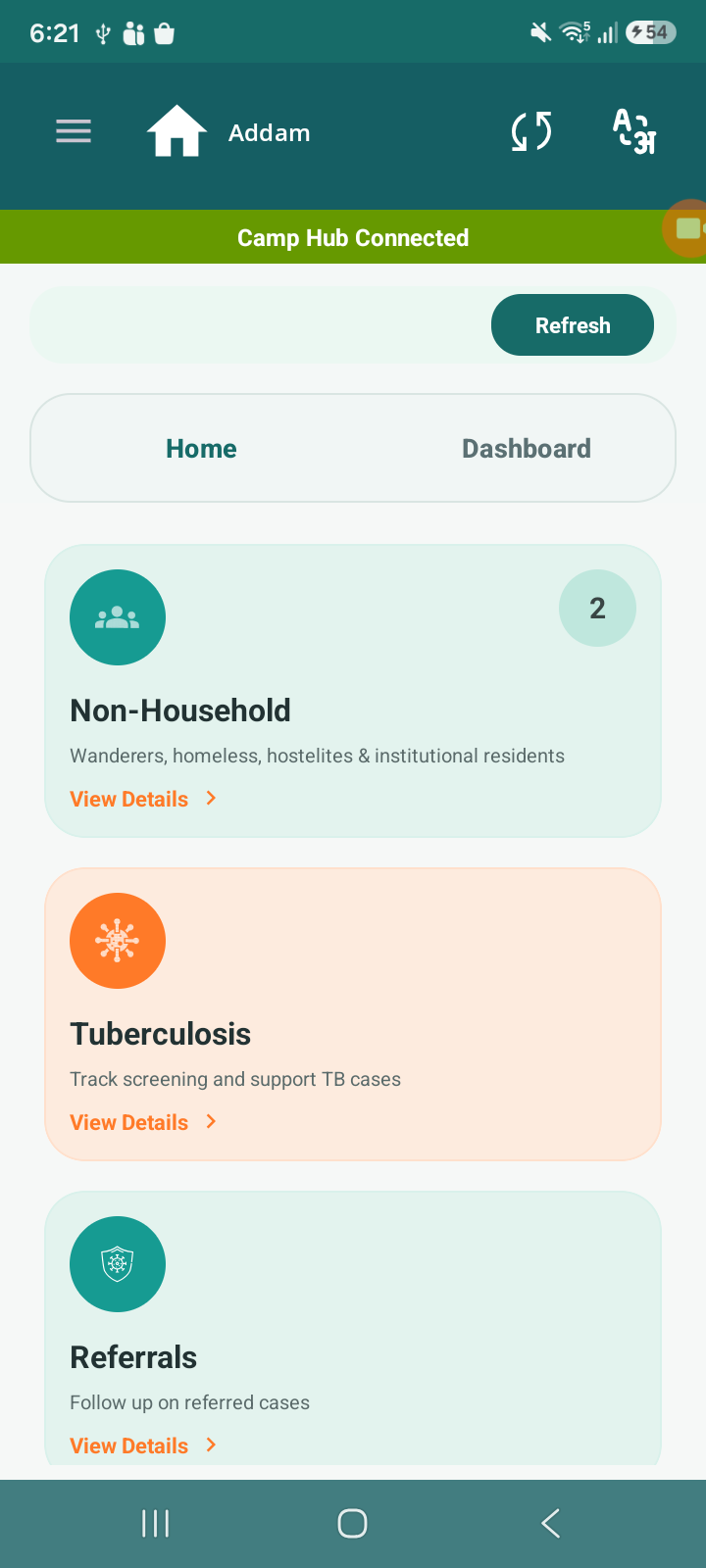
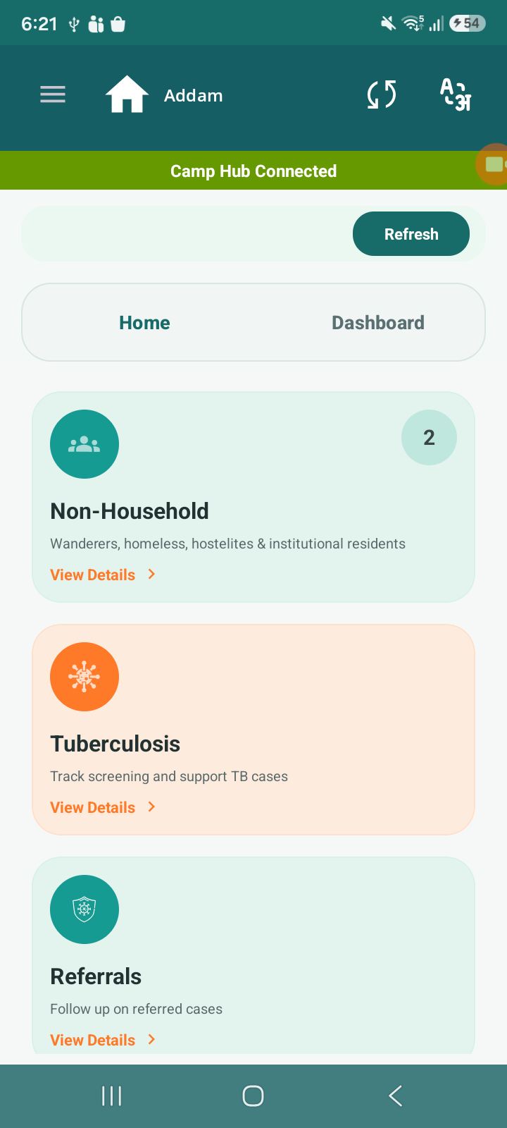
This makes the UI look crowded and less structured. As per the design pattern followed in other modules (as shown in reference screen), actions should ideally be presented in separate cards/sections for better clarity and usability.
Steps to Reproduce
- Login to the app
- Navigate to TB Confirmed List
- Observe any beneficiary card
- Check placement of:
- Start Counselling
- Follow Up
- Contact Tracing
- TPT Module
Expected Result
- Each action (Start Counselling, Follow Up, TPT Module, Contact Tracing) should be displayed in separate cards or clearly defined sections
- Screen should appear clean, structured, and user-friendly
Actual Result
- All actions are placed within the same card
- UI looks cluttered and less intuitive
- Difficult to visually distinguish between different actions
- relates to
-
STOP-618 Contact Tracing – add "Household" option, view/edit/update after submit, and "Any other Significant Information" (500 words)
-

- Todo/Open
-
-
 STOP-427
Separate Counselling, Contact Tracing, TB Treatment Follow-up, and TPT into distinct modules/cards (blocker for Role Based User Access - STOP-138)
STOP-427
Separate Counselling, Contact Tracing, TB Treatment Follow-up, and TPT into distinct modules/cards (blocker for Role Based User Access - STOP-138)
-
- Closed
-
-
-
- Analysis
-