-
Type:
Bug
-
Resolution: Unresolved
-
Priority:
 Low
Low
-
Affects Version/s: None
-
None
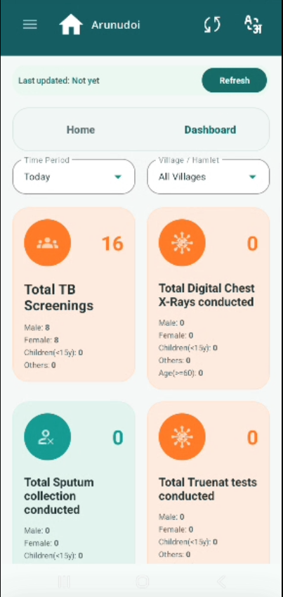
The Dashboard screen displays multiple data cards (Total TB Screenings, Total Digital
Chest X-Rays, Total Sputum Collection, Total Truenat Tests etc.) with large circular icons on the left side of each card. The icons are disproportionately large compared to the data content, reducing the visible space for numbers and demographic breakdowns (Male, Female, Children, Others, Age>=60).
Reducing the icon size will improve data readability and overall dashboard clarity, especially on smaller screens used by field volunteers.
Current Behaviour:
- Each dashboard card has a large circular icon (orange or teal) on the left.
- The icon occupies a significant portion of the card area.
- Data values (count, Male/Female/Children breakdown) are displayed in a smaller
font alongside the large icon.
Expected Behaviour:
- Icon size should be reduced to a smaller, compact size — enough to identify the
card type visually but not dominate the card layout. - Reduced icon size will give more space to the count numbers and demographic
breakdown data. - Cards should be easier to scan and read quickly during camp operations.