Medium
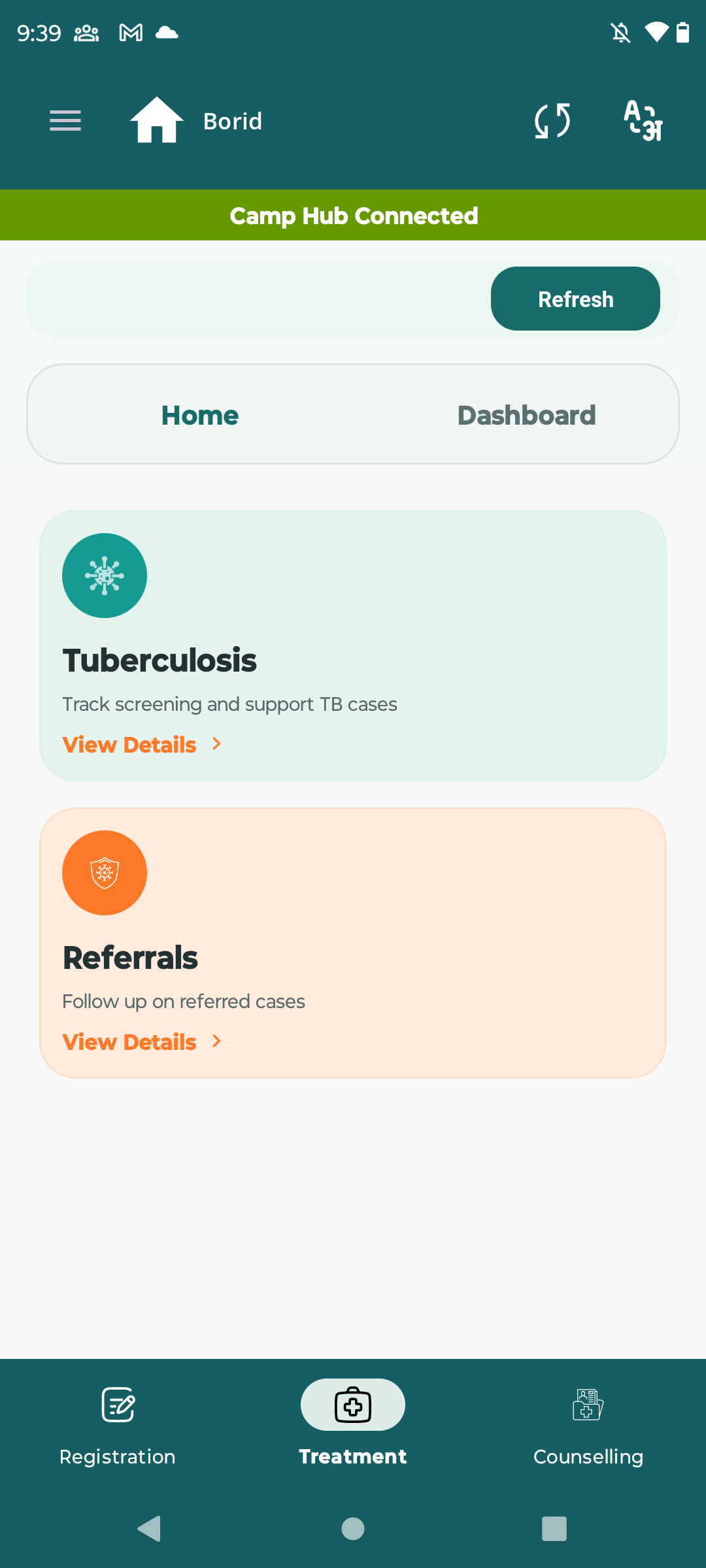
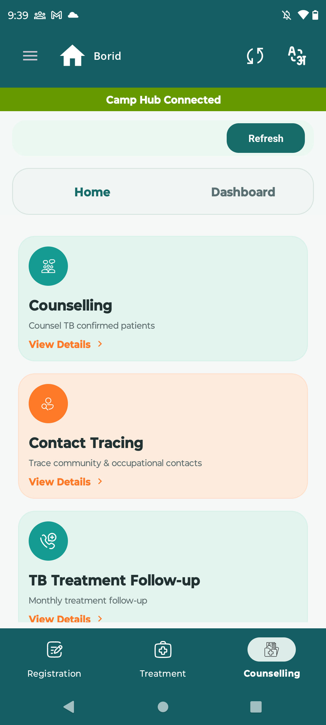
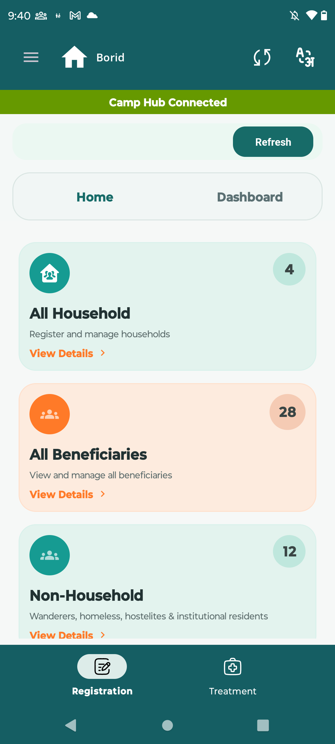
 On the Home screen, the role indicator section (e.g., Treatment, Registration, Counselling) is visually designed like a clickable button, but it is actually non-interactive.
This creates confusion for users, as they assume it is actionable (like navigation or feature access), whereas it only displays the current logged-in role.
Steps to Reproduce:
- Login to the application
- Navigate to Home screen
- Observe the bottom section showing:
- Treatment / Registration / Counselling
- Try to click on it
Actual Result:
- UI appears like a button (raised design, centered, icon-based)
- No action happens on click
Expected Result:
- Make it clearly non-clickable (label-style UI)
**