-
Type:
Bug
-
Resolution: Done
-
Priority:
 Medium
-
Affects Version/s: None
-
None
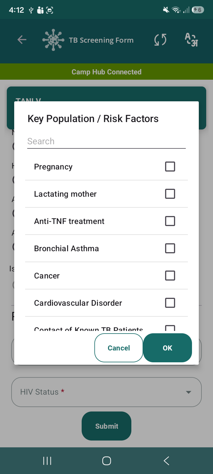
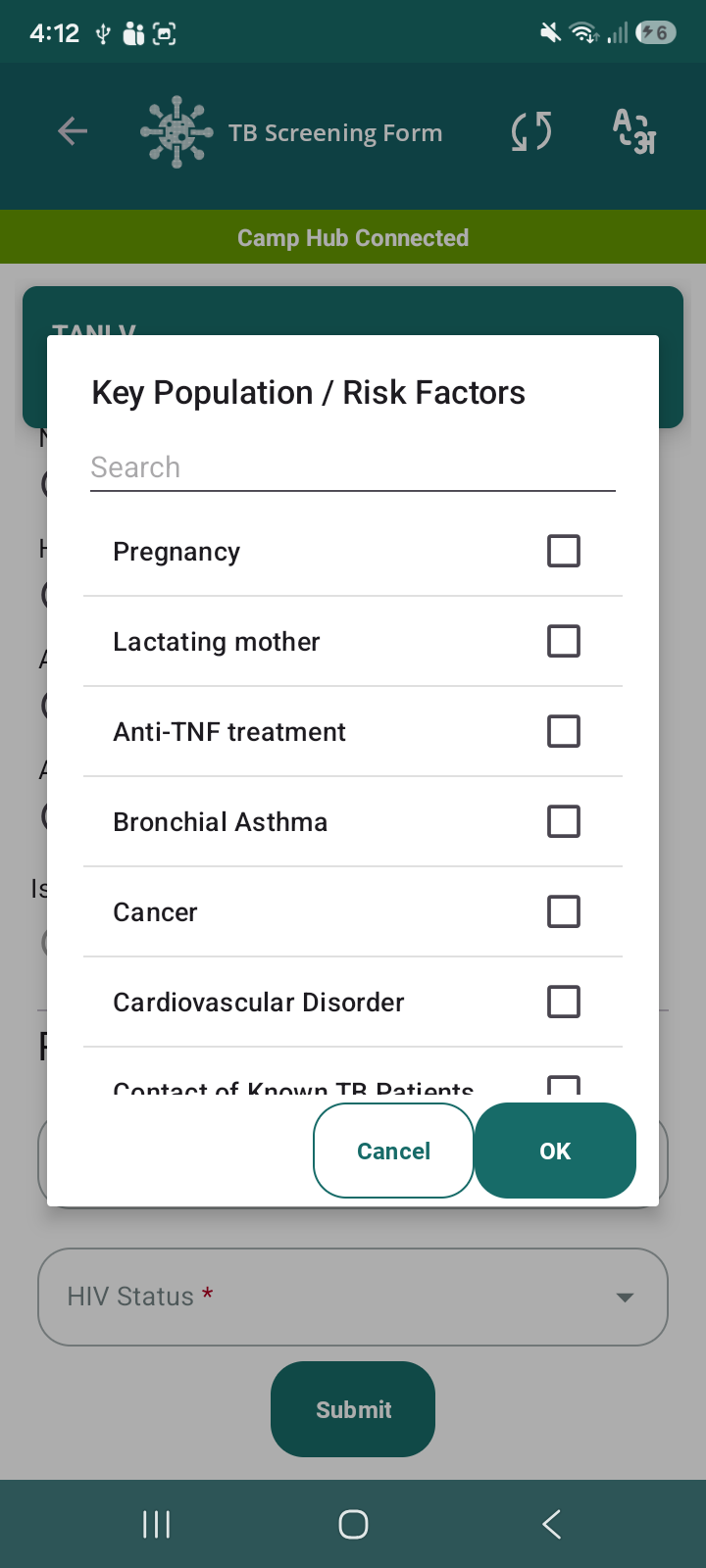
In the Key Population / Risk Factors pop-up within the TB Screening Form, the Cancel and OK buttons are not properly aligned.
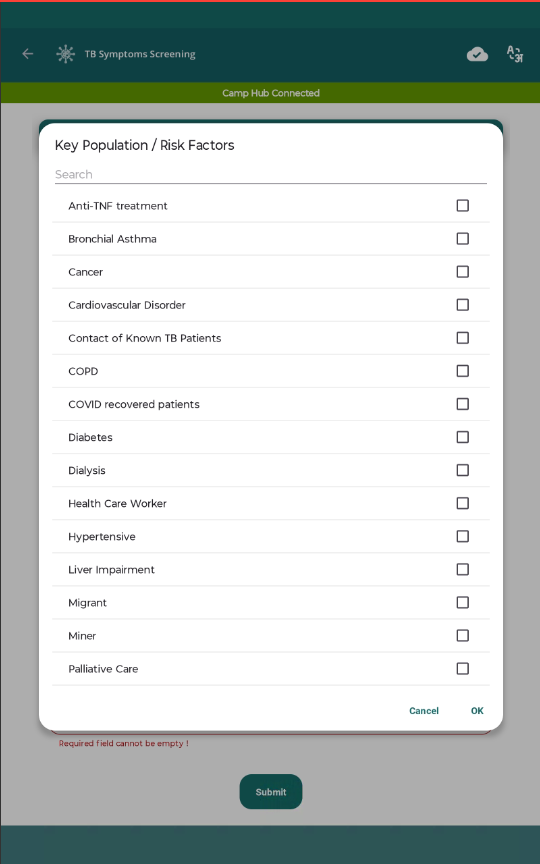
Additionally, the overall UI of the pop-up appears outdated and lacks proper spacing, alignment, and visual hierarchy, which impacts usability and consistency with the rest of the application.
Steps to Reproduce:
- Open the application
- Navigate to TB Screening Form
- Tap on Key Population / Risk Factors field
- Observe the pop-up UI
Actual Result:
- Cancel and OK buttons are not touching/aligned properly
- Uneven spacing between buttons
- UI looks basic and less user-friendly
- No proper visual hierarchy in list items
Expected Result:
- Cancel and OK buttons should be adjacent and properly aligned
- Buttons should follow consistent design standards
- Pop-up UI should be improved with:
- Better spacing and padding
- Clear alignment of text and checkboxes
- Improved visual hierarchy
- Consistent styling with app theme