-
Type:
Bug
-
Resolution: Done
-
Priority:
 Highest
-
Affects Version/s: None
-
None
-
STOP TB Sprint 7
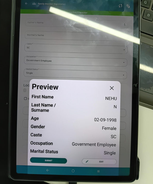
Before registering a beneficiary there is a popup that comes on the screen for registrar to review.
Both edit and preview buttons look the same. People get confused. The ux is off.