-
Type:
Bug
-
Resolution: Unresolved
-
Priority:
 Medium
-
Affects Version/s: None
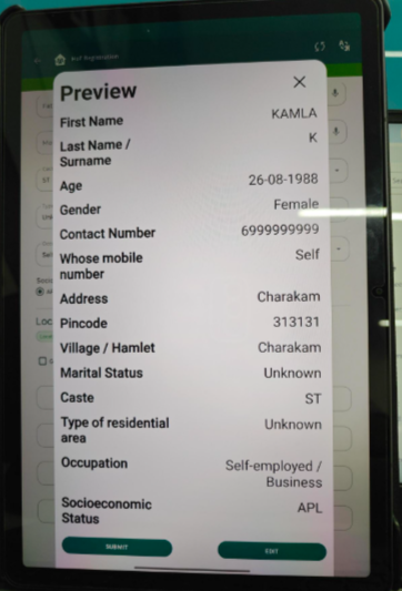
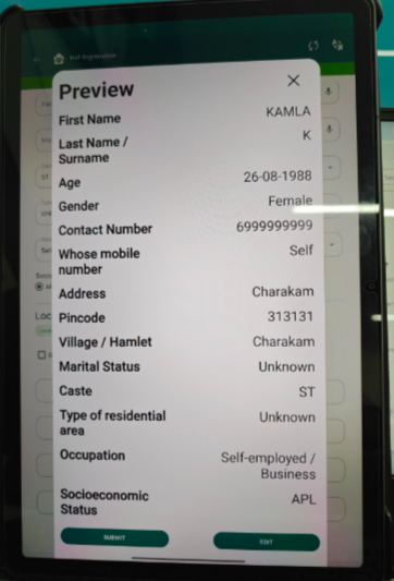
In the Preview screen, the UI is not user-friendly and creates confusion due to poor visual hierarchy and similar button styling.
Steps to Reproduce:
- Login to the application.
- Navigate to the relevant registration module (Household/Beneficiary registration).
- Fill in the required details.
- Click on the Preview button.
- Observe the Preview popup screen.
Expected Result:
- Text should be properly styled with balanced font weight and better readability.
- Clear spacing and hierarchy should be maintained.
- Preview and Edit buttons should be visually distinct (different color/style/CTA emphasis).
Actual Result:
- Overly bold text and similar-looking buttons reduce usability and clarity.