-
Type:
Bug
-
Resolution: Done
-
Priority:
 Medium
-
Affects Version/s: None
-
None
There are multiple UI inconsistencies observed in action buttons across the application:
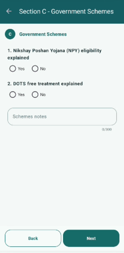
- The "Follow-up" and "Start Counselling" buttons are not visually consistent in terms of size, color, font, or alignment.
- The "Back" and "Submit" buttons also differ in styling and placement across screens.
These buttons represent primary user actions and should follow a consistent design system. The current inconsistencies impact overall UI uniformity and user experience.
Steps to Reproduce:
- Navigate to the Counselling / Confirmed TB Cases screen.
- Observe "Follow-up" and "Start Counselling" buttons.
- Compare their UI styling.
- Navigate to any form screen (e.g., Registration / Vitals / Counselling).
- Observe "Back" and "Submit" buttons.
- Compare their UI styling and alignment.
Expected Result:
- All action buttons ("Follow-up", "Start Counselling", "Back", "Submit") should follow a consistent UI design.
- Buttons should have uniform size, color, font, spacing, and alignment.
- UI should adhere to a standard design system across the application.
Actual Result:
- "Follow-up" and "Start Counselling" buttons have inconsistent styling.
- "Back" and "Submit" buttons are not uniform in design and alignment across screens.
- blocks
-
 STOP-141
Counselling Module
STOP-141
Counselling Module
-

- Closed
-
