-
Type:
Bug
-
Resolution: Done
-
Priority:
 Medium
-
Affects Version/s: None
-
None
-
HWC Web App
-
UAT
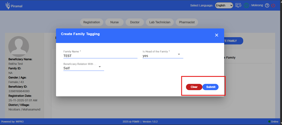
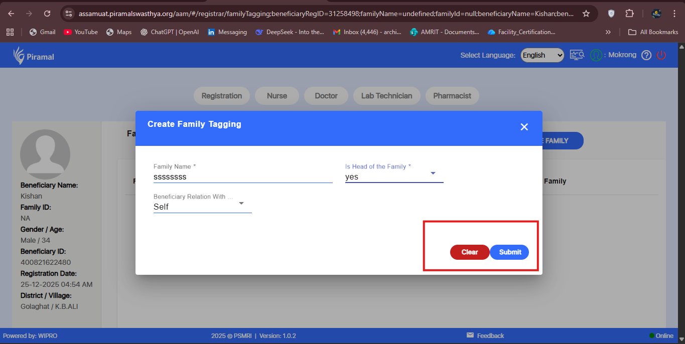
In the Create Family Tagging popup under the Registration module, the Clear and Submit action buttons are placed very close to each other.
This increases the risk of accidental clicks—particularly clicking Clear instead of Submit—and affects overall usability.
Proper spacing or padding between the two buttons is required to ensure clear distinction and reduce user error.
Steps to Reproduce:
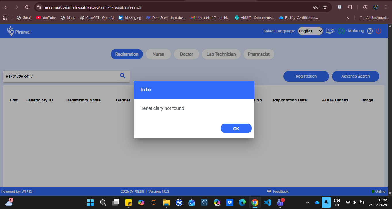
- Login to the application.
- Navigate to Registration.
- Open any beneficiary record.
- Click on Create Family to open the Create Family Tagging popup.
- Observe the spacing between the Clear and Submit buttons.
Expected Result:
There should be adequate spacing or padding between the Clear and Submit buttons to ensure clear separation and prevent accidental clicks.
Actual Result:
The Clear and Submit buttons are placed too close to each other, causing potential usability issues.